YouTube's brand new look is here. The company had been testing the re-design for quite some time with screenshots grabbing headlines over the last few months. Now, it is finally official.
YouTube calls the new design, "simple, consistent and beautiful." Gone are the cards and overlays, instead you are greeted to a calm white background and the rest of the content just floats over it. There is more white space here than I would like, but overall, the new design feels more coherent.

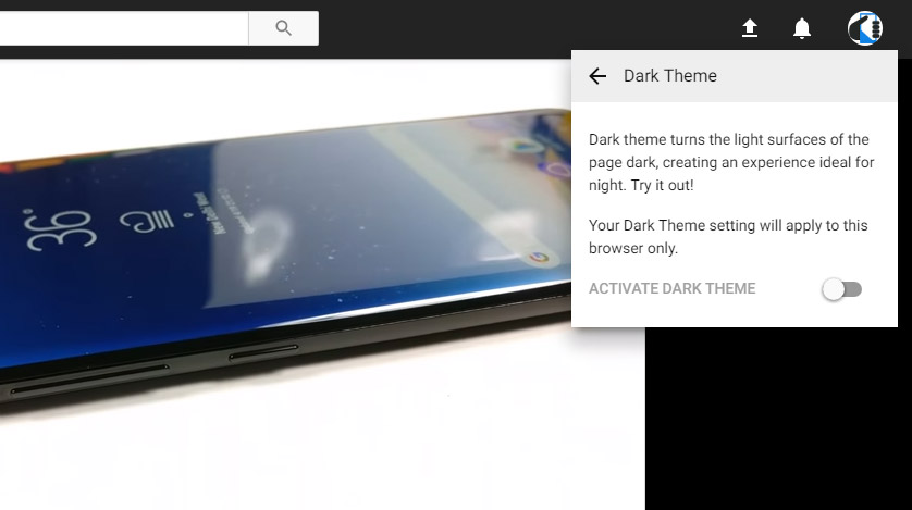
The search bar now stays pinned to the top but the biggest change here is the new "Dark Mode". You can turn it on from the new profile menu, which can be accessed by clicking your profile picture. Even there you see the clutter has been minimized with multi-option menus loading within the same area.
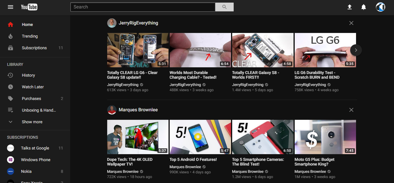
Now, coming back to the dark mode, once enabled all the white elements change to black making the entire design look more pleasing. The text too gets a shade of gray instead of stark white, for a more soothing experience.
How to get the new YouTube re-design with Dark Mode?
The new design is currently still rolling out to all users, but you can preview it by heading to youtube.com/new. Google's new Material Design apps for the web are built on its Polymer JavaScript framework, which the company says would enable faster design and feature updates. The dark mode is one such feature and they promise a lot more powerful new features are in the pipeline.


