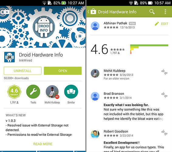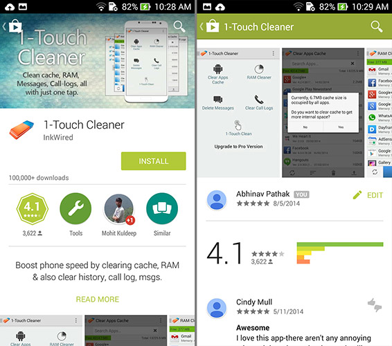
Google Play Store update v4.9.13 brings in the new image-rich Material Design makeover. The new Play Store app which is being rolled out uses large feature graphic as the header of the app description, if developers have made a video then it takes the top spot instead of being in the screenshot slideshow. There are many other changes including new animations, content panes for app-description as well as reviews & ratings.

App descriptions as well as ratings have become easier to read. The share button from the top bar has now been removed and you can now share using the +1 button found below the featured reviews. The new UI lays emphasis on ratings and reviews from people in your circle.

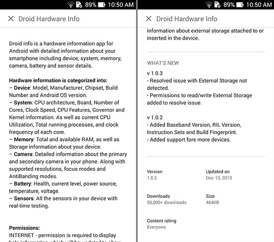
All app details including last updated, APK size, Top Developer badge are now part of the app description and not the main content page. You need to tap on Read More to access this content. App category, Ratings as well as Similar apps have been made into icons for easy access. The new Material Design makeover of the Play Store highlights Google's approach towards design, where accessibility is being given prime importance over actual content.


